

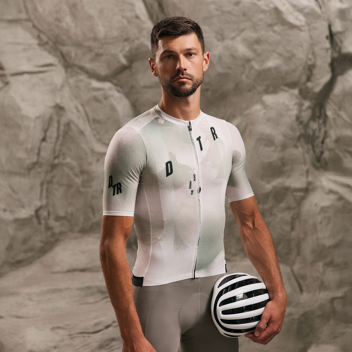
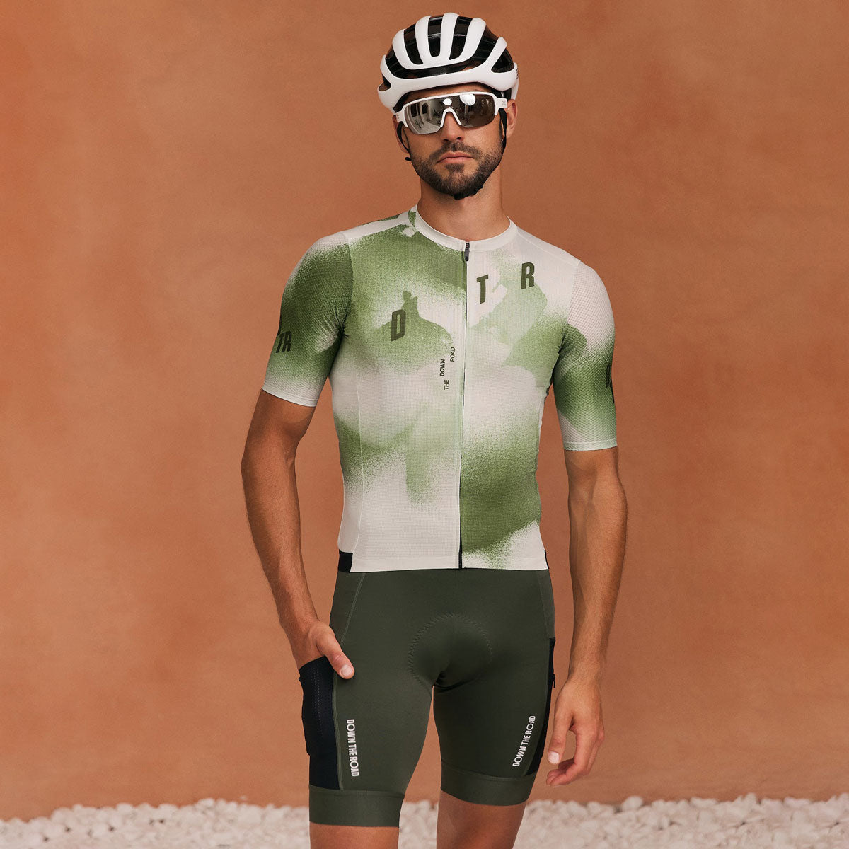
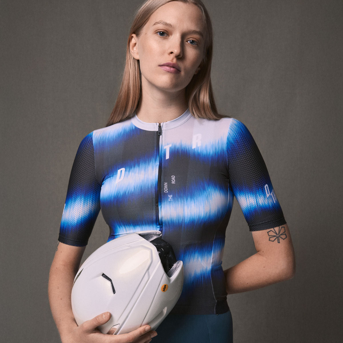
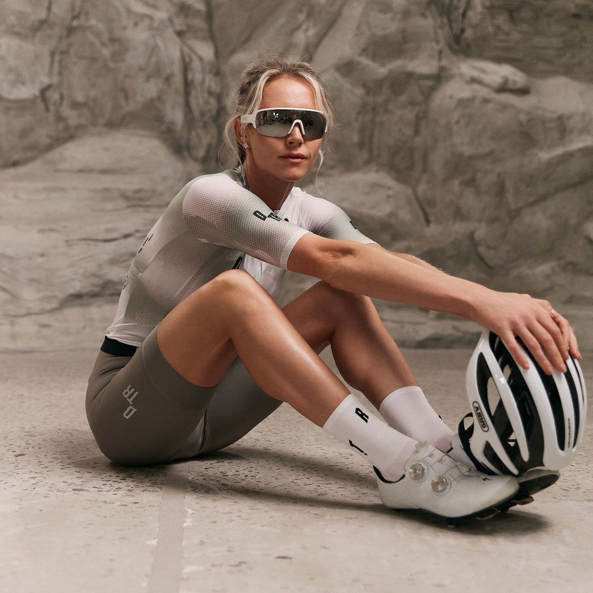
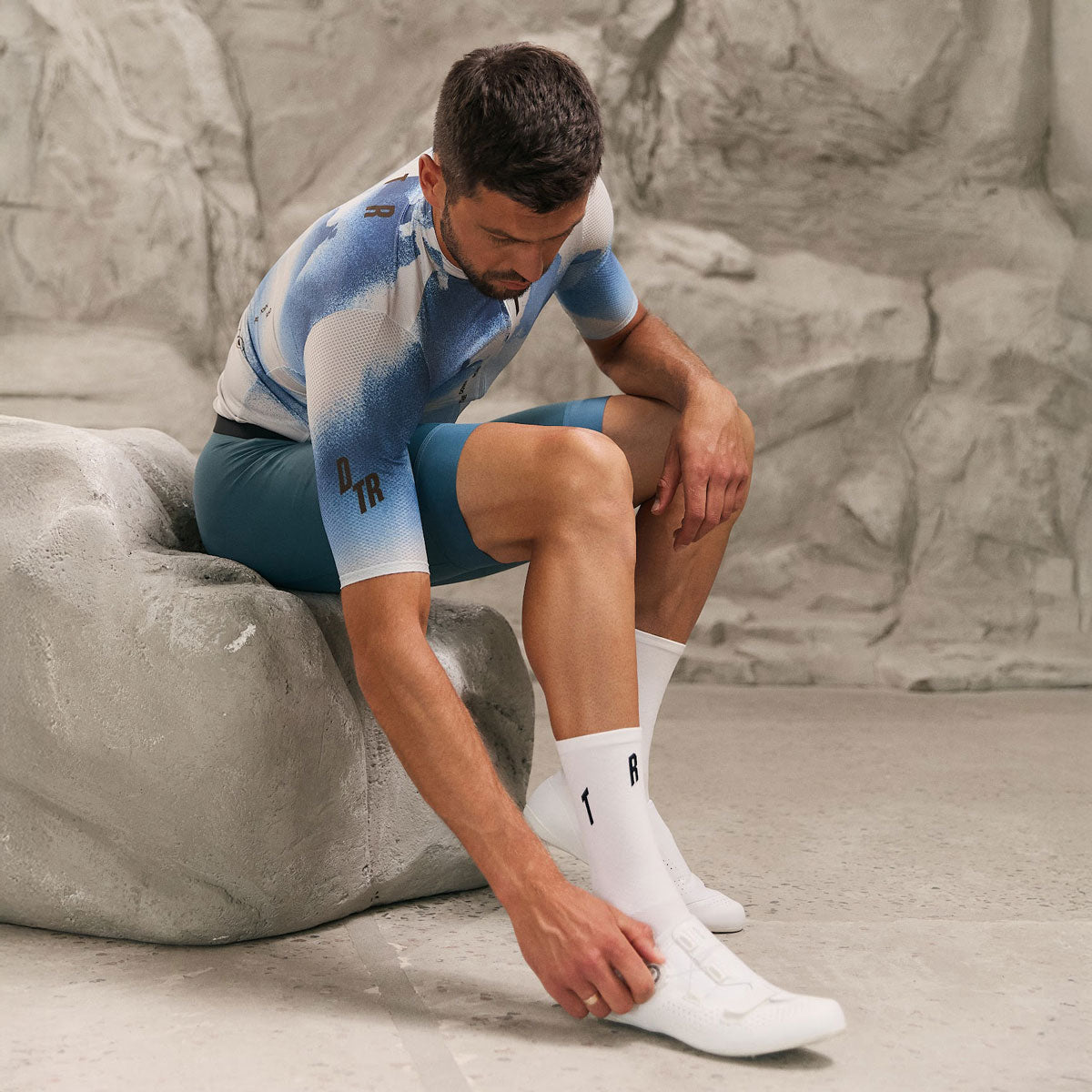
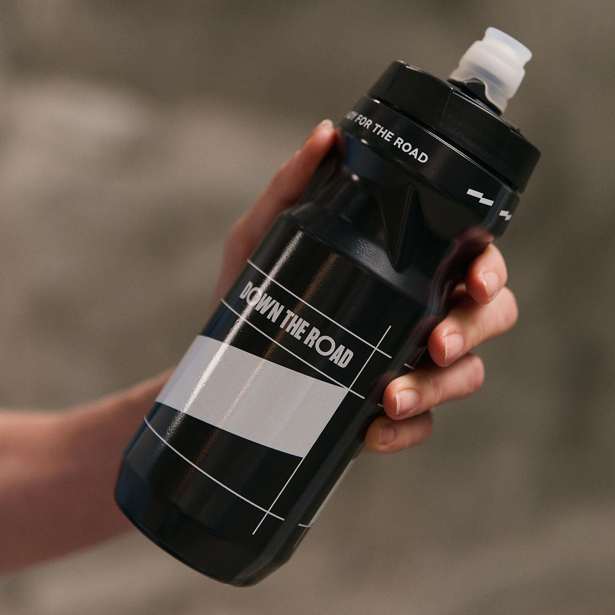
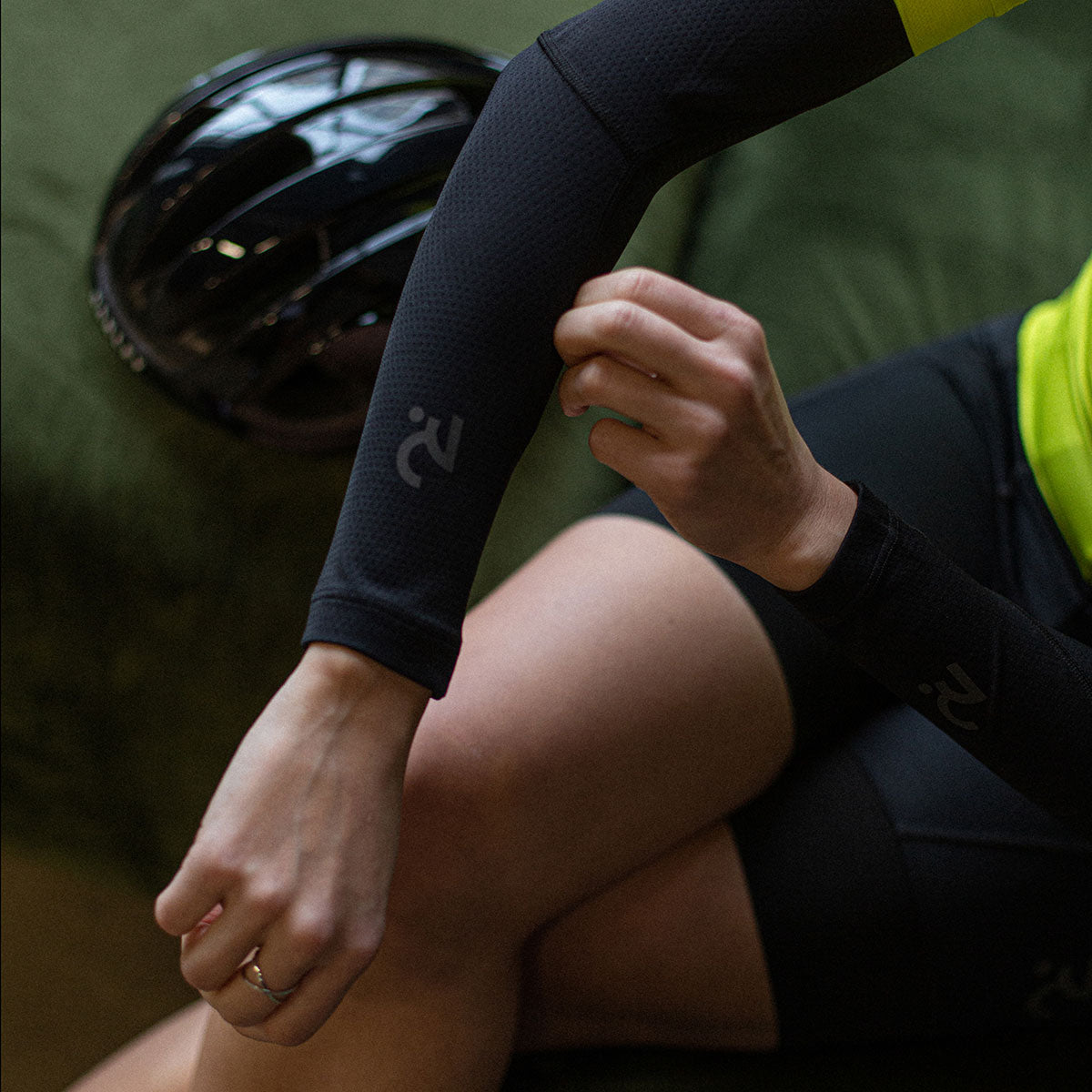
The custom kit design mistakes that cost clubs the most are low contrast, logos placed across seams and folds, colours judged on a screen instead of fabric, and approving a proof without checking it on a rider. This guide covers each one and how to avoid it before anything goes to production.
What are the most common custom kit design mistakes?
The same few errors show up in club and team kit again and again: too many colours, low contrast between design and base colour, text that is too small to read at speed, logos placed where fabric stretches or folds, and a proof approved without checking sizes. None of them are hard to fix at the design stage, and all of them are hard to fix after production.
Why does low contrast ruin a design?
A kit is seen moving, from a distance and from behind, so subtle tones that look elegant on screen disappear on the road. Dark grey on black, pale blue on white and gradients that fade into the base colour all lose their shape. Check the design at thumbnail size: if the main shapes and the club name are still readable, the contrast is working. Our custom cycling kit design ideas show layouts that read clearly at speed.
Where should logos go, and where should they not?
Logos should sit on flat, low-stretch areas of the jersey and bibs: the chest, the upper back and the sleeve. Avoid placing them across side seams, underarm panels, the lower back where a pocket sits, or the leg openings, where fabric folds and stretches and the logo distorts. Sponsor logos need clear space around them and a minimum size so they stay legible. See sponsor logo placement on cycling kit for the detail.
Why do colours look different on fabric than on a screen?
Screens emit light and fabric reflects it, so a bright saturated colour on a monitor can look flatter or darker on the finished kit. Neon and very light shades are the most affected. Ask for a physical colour reference or check the proof against a known swatch, and never approve a brand colour from a screen alone. Our guide to sponsor colour matching goes through how to do it.
Can you put too much on a kit?
Yes. A kit carrying six colours, a crest, a sponsor wall and a pattern usually reads as noise. Pick a base, one or two accent colours and a clear hierarchy: club name first, sponsors second, detail last. The same logic applies when you need to refresh a club design without losing recognition.
What about white and light colours?
Light bases show every sweat mark and, in bib shorts, can become see-through when stretched. If your club wants a white or pale kit, talk it through at the brief stage; our guide on white bib shorts and see-through fabric explains the issue.
Why is the proof so important?
The proof is your last chance to catch placement, spelling and colour errors before production, so treat it as a checklist, not a formality. Check every name, every logo position on each size, and the front, back and sleeves. Nothing goes to production without your sign-off, so take the time. Our proof and approval guide covers what to look for, and the design brief guide helps you start with the right information.
FAQ
How many colours should a club kit have?
A base plus one or two accents keeps it readable and easier to reproduce.
Should the club name be on the back?
If riders are seen from behind in groups, yes. Make it large enough to read at distance.
Can we change the design after the proof?
Changes are easier before approval. Treat the proof as final.
Ready to start? Tell us your brief on the DTR custom apparel page and request a quote.
DTR — performance cycling and triathlon apparel, designed and developed in Ukraine.

Leave a comment
This site is protected by hCaptcha and the hCaptcha Privacy Policy and Terms of Service apply.