

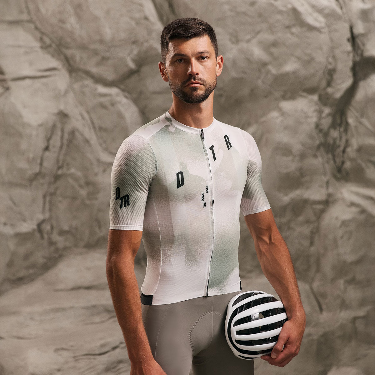
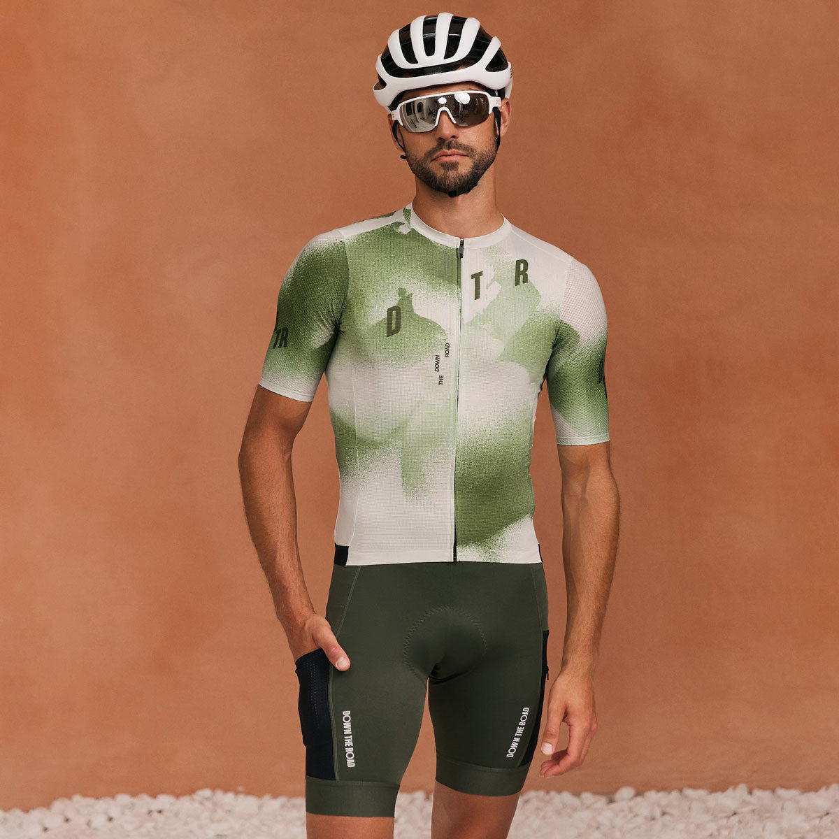
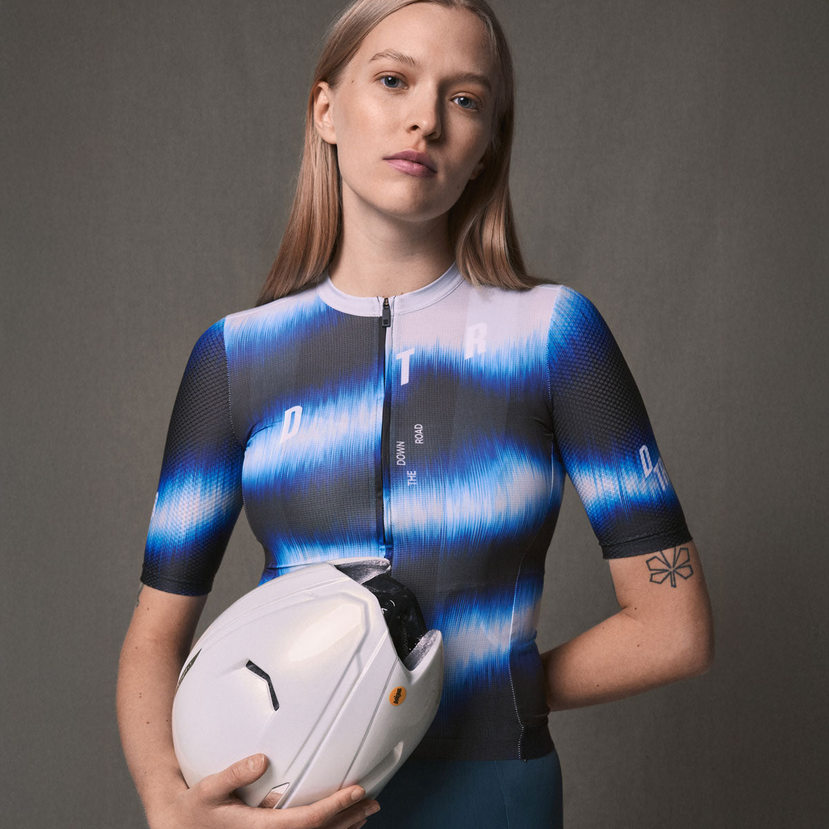
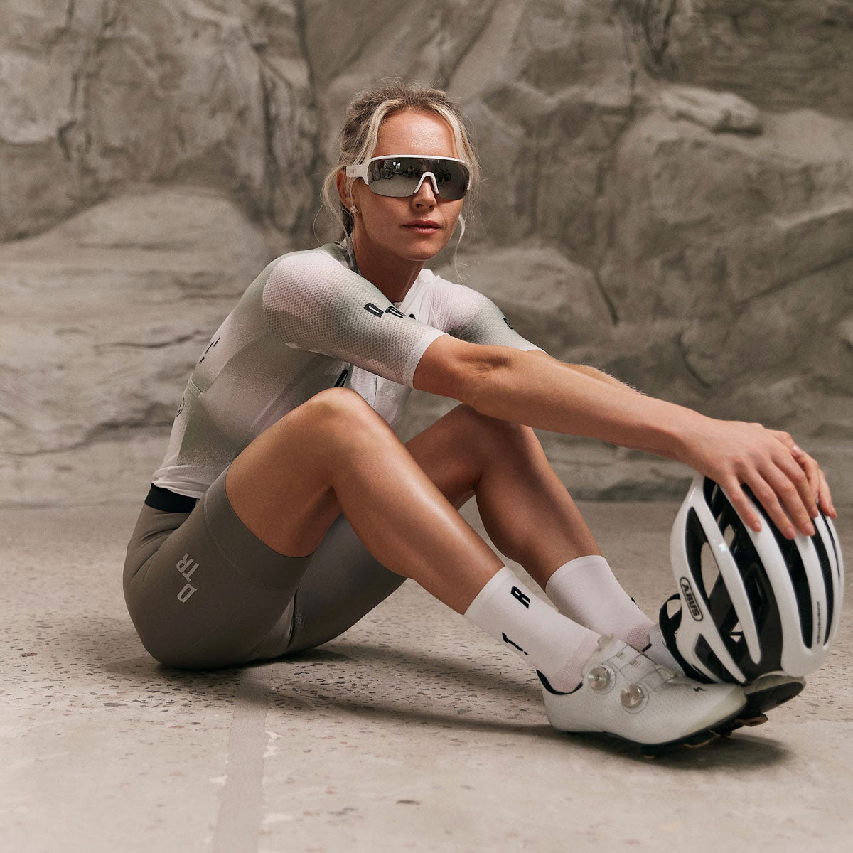
The most visible spots for sponsor logos on cycling kit are the chest and the upper back — and the chest of a gilet or jacket outranks everything, because it is worn over the rest of the kit for much of the season. This guide covers the placement hierarchy, what survives sublimation at small sizes, single- versus multi-sponsor layouts, and the files to request before design starts.
The visibility hierarchy
Ranked by real-world visibility: the chest of a gilet or jacket first, the jersey chest second, the upper back panel third — pockets interrupt anything lower — and sleeves and side panels last. Photos, group rides and finish lines all favour the front of the torso; design from that order outward.
The reason the gilet outranks the jersey is simple: in most climates it is worn over the jersey exactly when the photos happen — early starts, events, changeable weather. A title sponsor placed only on the jersey chest disappears every time the gilet goes on.
Where do logos work on a jersey?
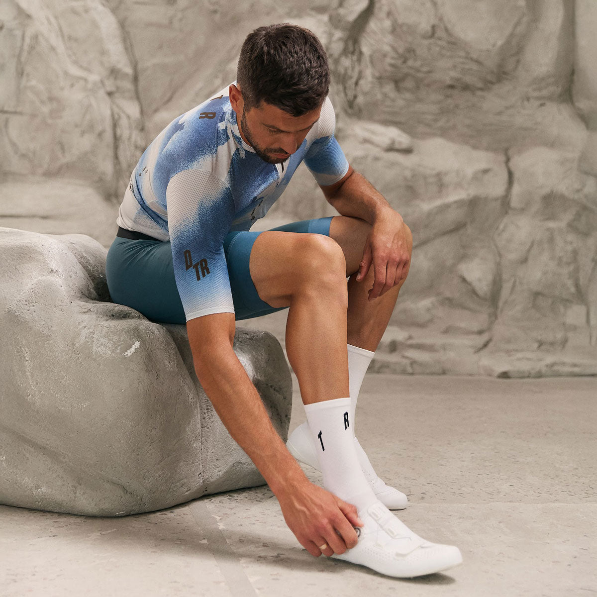
The chest band and the upper back are the reliable zones: flat, forward- or camera-facing, uninterrupted by pockets or zips in most designs. Sleeves take small secondary marks well; side panels are moving, often shadowed, and best treated as accent space rather than sponsor space.
Remember the rear view is what the bunch sees most: an upper-back logo above the pockets earns more ride-time visibility than most clubs expect. Below the pockets, curvature and cargo make logos unreadable.
What survives sublimation at small sizes?
Sublimation reproduces colour and shape faithfully — what it cannot rescue is detail that was too fine to begin with. Thin strokes, small lettering and intricate marks blur at sleeve scale. The practical rule: if a logo is not legible at 6–8 cm wide on screen, it needs a simpler version for small placements.
Ask sponsors whether a simplified or single-colour variant of their mark exists — most brands have one. Gradients and photographic elements print, but at small sizes they read as noise, not identity.
One sponsor or ten?
A single-sponsor layout gets the chest and upper back and room to breathe. Multi-sponsor kit needs a tier system decided before design starts: title sponsor on chest and upper back, second tier on sleeves and hip, supporting logos in a consistent band — not scattered wherever space remains.
The kit designs that age worst are the ones that said yes to every logo at every size. A visible few beats an unreadable many — and sponsors themselves get more value from one clean placement than three cramped ones.
What files should you ask sponsors for?
Vector files — PDF, AI, EPS or SVG — plus the brand's colour references, and a single-colour version of the mark. Vector artwork scales to any placement without quality loss; a screenshot pulled from a website does not survive a chest panel.
Collect the files before design rounds begin. Chasing logo files mid-design is one of the most common ways club kit timelines slip — the calendar side of that is covered in the custom kit timeline.
FAQ
Where is a sponsor logo most visible on cycling kit? The chest of a gilet or jacket, then the jersey chest, then the upper back.
Do logos work on bib shorts? Yes — the thigh panel reads well and suits secondary sponsors; keep clear of the leg gripper.
What is the minimum useful logo size? If it is not legible at roughly 6–8 cm wide, use a simplified version for that placement.
Do sublimated logos fade or crack? No — sublimation prints the design into the fabric, so logos wear as long as the garment does.
The bottom line
Decide the hierarchy first, collect vector files early, and give the title sponsor the chest. Tell us your brief — sponsors, tiers and all — and we will take it from there: request a quote.
DTR — performance cycling and triathlon apparel, designed and developed in Ukraine.

Leave a comment
This site is protected by hCaptcha and the hCaptcha Privacy Policy and Terms of Service apply.