

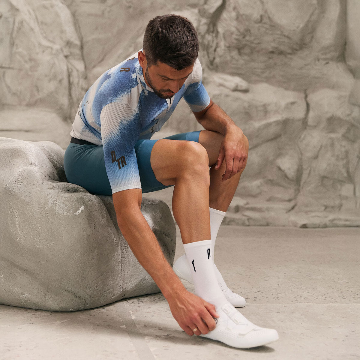
A club kit design works when three things are true: it reads at speed from twenty metres, it survives printing without losing the detail that made it good, and it can be reordered in two years without the colours drifting. Most designs that disappoint fail on one of those three — rarely on taste.
This guide covers designing for the body in the riding position rather than the flat mockup, what sublimation handles well and badly, where sponsor logos actually get seen, how colour choice plays into heat, and how to keep a design you can come back to.
Design for the body, not the flat mockup
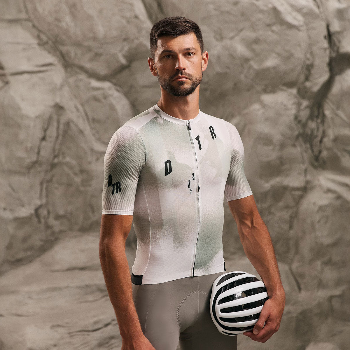
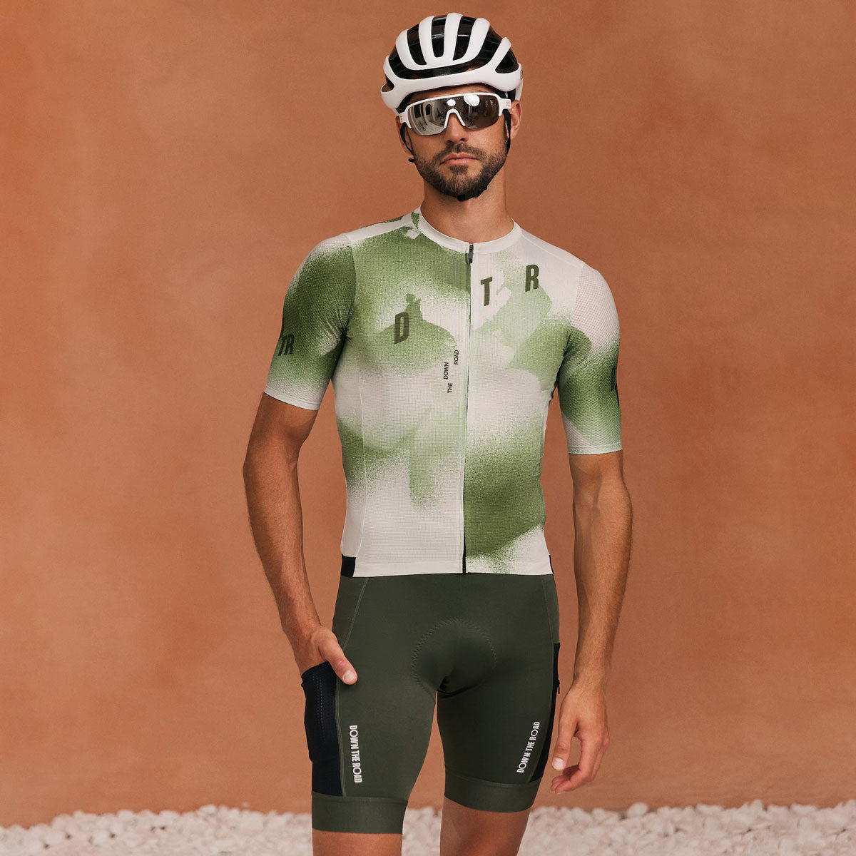
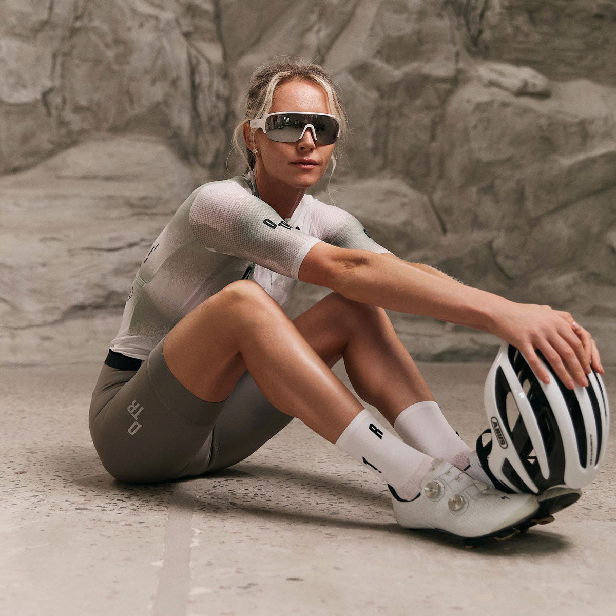
A jersey design is approved as a flat rectangle and worn as a curved, folded, moving surface. The chest panel disappears into the arms once a rider is on the hoods. The lower back is compressed and partly covered by loaded pockets. The shoulders and upper sleeves are the largest uninterrupted area anyone actually sees from behind, which is where most groups spend their time looking at each other.
What follows from that is simple: put the elements that matter most — club name, primary mark — across the chest and the upper back, keep detail off the lower back, and treat the sleeves as prime real estate rather than an afterthought. Ask to see the design rendered on a rider in position before signing anything off.
What sublimation handles well and badly
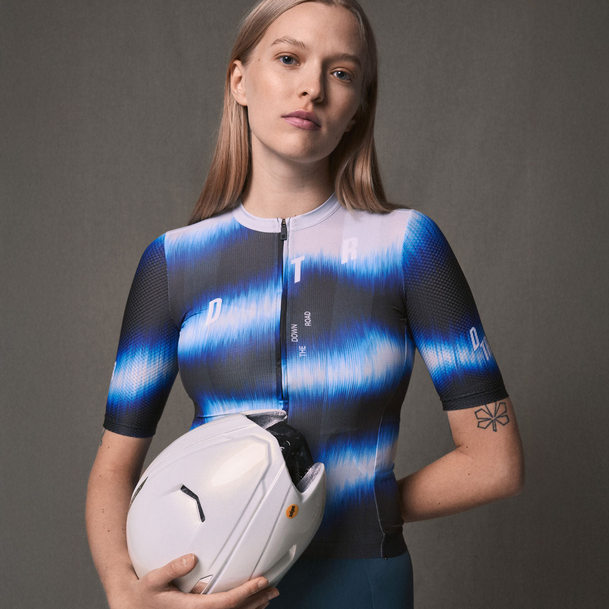
Sublimation prints the design into the fabric rather than onto it, so it does not crack, peel or fade the way a pressed transfer does, and it adds no weight or stiffness. It handles saturated colour, gradients, photographic imagery and full-coverage patterns without difficulty — things that are expensive or impossible with other methods.
Where it needs care is fine detail and precise colour matching. Very thin lines and small text can soften slightly as the ink migrates into the fibres, so a logo that works on a business card may not hold at 8mm on a sleeve. Colours are matched as closely as the process allows, but a screen and a dyed fabric are different media — if an exact brand colour is critical, say so early and work from a physical reference rather than a hex code.
The practical rule: design bold, keep the smallest text larger than you think it needs to be, and avoid hairline rules as structural elements.
Where sponsor logos actually get seen
Sponsors are usually promised visibility and given placement, which are not the same thing. In ride photographs and race images, the areas that consistently appear are the chest, the upper back, and the outside of the thighs on bib shorts. The lower back is hidden by pockets and bags. The inside of the arm is essentially never seen.
Build a hierarchy before you place anything: one primary sponsor with a genuinely prominent position, two or three secondary marks at a consistent smaller size, and everyone else grouped in a single tidy band. A kit carrying eleven logos at the same size communicates nothing and looks cluttered at any speed. It is easier to have the conversation about tiers at the design stage than after the kit ships.
Colour, contrast and heat
Dark colours absorb more heat. On a summer kit for a hot region, a predominantly black jersey is a real comfort cost over a four-hour ride, and a lighter body with darker accent panels is the more sensible design. In cold climates the trade-off is less relevant, and dark kit hides road grime better through winter.
Contrast is a separate question from colour. A design that looks striking on screen can vanish in flat grey light, so if the club rides through autumn and winter, build in a fluorescent element or a high-contrast band. Visibility and identity are solved by the same design decision when you plan for it, and by neither when you do not.
Designing something you can reorder
Clubs gain members. New riders need kit that matches what everyone else is wearing, and a design that depended on a one-off effect or an exact dye lot creates a problem in eighteen months. Design with reordering in mind from the start.
In practice this means keeping the design on file with us so no redesign is needed, expecting colour consistency to be managed batch to batch, and keeping the core layout stable while allowing small annual variations — a change of accent colour or a new season badge — rather than a full redesign every year. Reorders run from 5–10 pieces depending on the garment, so topping up for new members is straightforward rather than a whole new project.
What to hand over to the design team
The brief matters more than the reference images. Useful things to send: vector artwork for your logo and any sponsor marks, brand colours with a physical reference if the match is critical, the garments you want in the range, an approximate rider count, and the date you need kit in hands.
Also worth saying out loud: where the club rides and in what weather, whether the design needs to work across cycling and triathlon garments, and any constraint you already know about — a sponsor contract requiring a certain size, a colour you cannot use. Production runs roughly 6–8 weeks from sign-off, so working back from an event or season start is the right way to plan. Nothing goes to production without your approval.
Frequently asked questions
How many designs can we look at before deciding?
Enough to get it right. The process is iterative and nothing is produced until you have approved the final design.
Can we match our exact club colours?
We match as closely as the process allows and work from a physical reference where an exact match matters. Flag critical colours at the start rather than at proof stage.
What is the minimum order?
From 5–10 pieces depending on the garment, which also applies to reorders for new members.
Can different garments share one design?
Yes, and they should. A design is adapted across jerseys, bib shorts, gilets and trisuits so the range reads as one kit rather than several.
How far ahead should we start?
Production runs about 6–8 weeks from final sign-off, and design and size collection take time before that. For a season start, begin the conversation a few months out.
Can we change the design next season?
Yes. Most clubs keep the core layout and vary an accent colour or badge, which keeps old and new kit recognisably the same club.
Tell us your brief and we will take it from there: /pages/cycling-triathlon-custom-apparel.
DTR — performance cycling and triathlon apparel, designed and developed in Ukraine.

Leave a comment
This site is protected by hCaptcha and the hCaptcha Privacy Policy and Terms of Service apply.